
How color transforms window treatments: guide for spaces
TL;DR:Color choice in window treatments influences mood, perception, and energy efficiency in a room.Light colors enlarge spaces and reflect heat, while dark hues create warmth and reduce glare.Testing fabric swatches in real lighting conditions ensures cohesive, functional window treatment selections.
Color in window treatments is rarely treated as a functional decision. Most homeowners focus on pattern, fabric weight, or how a curtain pairs with the sofa, yet the color itself quietly shapes how a room feels, how large it appears, and even how much energy your home consumes. Research confirms that color influences mood and perception through measurable psychological effects, not just visual preference. Whether you are a homeowner refreshing a living room or an interior designer specifying treatments for a client, understanding the science and strategy behind color selection will help you make choices that are both beautiful and genuinely useful.
Table of Contents
- How color influences mood and perception in living spaces
- Color, light, and space: How hues alter room perception
- The science of color, function, and energy efficiency
- From principles to practice: Selecting color for your windows
- Perspective: Why one-size-fits-all color rules fall short in window treatments
- Enhance your windows with expert color guidance
- Frequently asked questions
Key Takeaways
| Point | Details |
|---|---|
| Color alters mood | Choosing the right color in window treatments can set the emotional tone and function of a room. |
| Light vs. dark effects | Lighter colors open up spaces, while darker hues add intimacy and coziness to large rooms. |
| Color impacts energy | Color affects heat reflection and insulation, making your window treatments a tool for comfort and efficiency. |
| No universal rules | Personal taste, room function, and light conditions shape the best color choice for window treatments. |
| Test before you buy | Testing swatches in your actual room setting helps ensure color works in real lighting and matches your design goals. |
How color influences mood and perception in living spaces
Color is not decoration alone. It is a signal the brain processes before conscious thought, and window treatments cover some of the largest surface areas in any room. That means your color choice carries real weight in setting the emotional tone of a space.
Warm colors such as reds, oranges, and yellows carry energy. They stimulate conversation and create a sense of warmth that draws people together. These shades work well in dining rooms, entryways, and social spaces where activity and engagement are the goal.
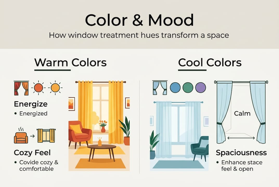
Cool colors such as blues, greens, and soft violets do the opposite. They slow the pace of a room, reduce perceived temperature, and support focus or rest. Bedrooms and home offices benefit most from these tones, where calm and concentration matter.
Neutrals such as ivory, warm gray, and taupe offer versatility. They adapt to shifting decor, complement varied furniture styles, and allow other design elements to take the lead. Many designers rely on neutrals as a foundation, then layer texture and pattern for visual interest.
The psychological effects of color are well documented, but it is worth noting that they are not universal. Personal associations, cultural backgrounds, and even the specific undertone of a hue all shift how a color reads in a given room. A dusty sage reads very differently from a vivid emerald, even though both are technically green.
Here is a quick reference for mood-based color selection:
| Color family | Mood effect | Best room application |
|---|---|---|
| Warm (red, orange, yellow) | Energizing, social, inviting | Dining rooms, living areas |
| Cool (blue, green, violet) | Calming, focused, restful | Bedrooms, offices |
| Neutral (ivory, taupe, gray) | Balanced, adaptable, timeless | Any room, layered looks |
Key considerations when selecting by mood:
- Match the color to the room’s primary function, not just its aesthetic
- Consider how the color reads at night under artificial light
- Account for the emotional associations of the specific occupants
- Review window treatment trends for 2026 for guidance on which palettes are gaining traction in residential design
Psychology provides a strong starting point, but it should inform your decision rather than dictate it. The most effective window treatment colors are those chosen with both function and feeling in mind.
Color, light, and space: How hues alter room perception
Establishing the emotional role of color invites a practical look at how hues physically alter our living environments. The relationship between color and light is one of the most underappreciated tools in interior design.
Light colors in window treatments make rooms appear larger and brighter, while dark colors add coziness but reduce the sense of space. This is not a stylistic opinion. It reflects how the eye processes reflected versus absorbed light. A small bedroom with ivory linen panels will feel noticeably more open than the same room dressed in charcoal velvet.
Room orientation adds another layer of complexity. North-facing rooms need warmer tones to counteract the cool, bluish quality of indirect light, while south-facing rooms receive abundant warm sunlight and can handle cooler or more saturated colors without feeling cold or flat.
Here is how color and light interact by room orientation:
| Room orientation | Light quality | Recommended color approach |
|---|---|---|
| North-facing | Cool, indirect | Warm whites, honey, soft terracotta |
| South-facing | Warm, abundant | Cool neutrals, sage, soft blue |
| East-facing | Warm morning light | Soft neutrals, blush, pale gold |
| West-facing | Warm afternoon light | Cooler tones to balance intensity |
How to test color effectively before committing:
- Order fabric swatches in your top two or three color choices
- Pin them to the window frame and observe at different times of day
- Check morning light, midday, and evening under your artificial lighting
- Step back to assess how the color shifts the perceived size of the room
- Compare against your existing furniture and wall color in natural light
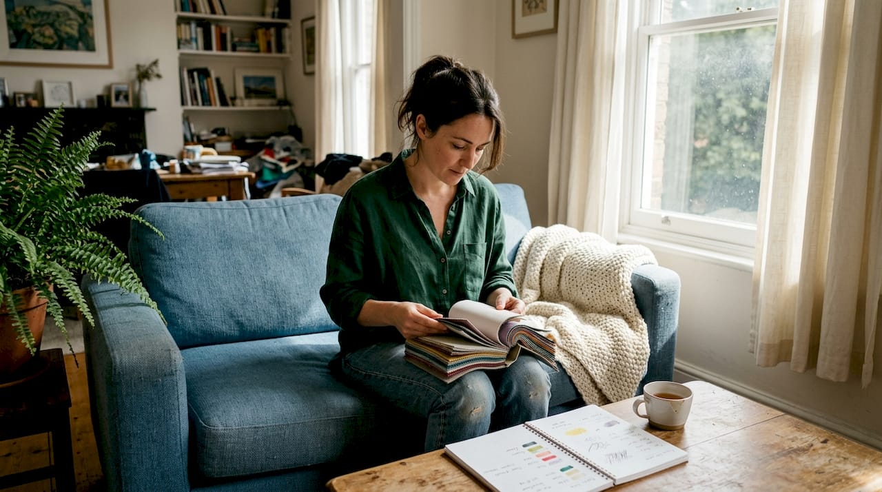
Pro Tip: Never select a window treatment color from a digital screen alone. Screen color rendering varies significantly between devices, and what looks like a soft sage online may arrive as a vivid green. Always request physical swatches before ordering, especially for custom work.
For those pursuing an adaptable and unified home design, testing swatches in real lighting conditions is one of the most reliable ways to avoid costly mistakes and achieve a result that feels cohesive and intentional.
The science of color, function, and energy efficiency
Beyond changing how a space feels and looks, color directly affects how your windows perform. This is where design decisions intersect with measurable home performance.
Color plays a direct role in thermal management. Light colors reflect heat in summer, reducing solar gain and keeping interiors cooler. Dark colors absorb and retain heat, which improves insulation in winter. Honeycomb blinds, for example, can retain up to 311% more heat than standard single-layer treatments, and pairing that structure with an appropriate color amplifies the benefit.
Glare is another functional concern that color directly addresses. A scientific study on colored glazing found that red and blue window treatments create more discomfort glare, while green and neutral tones minimize it. For rooms with significant sun exposure, such as west-facing offices or sunrooms, this finding has real implications for comfort and productivity.
Key functional benefits by color category:
- Light colors: Reflect solar heat, reduce cooling costs in summer, brighten interiors naturally
- Dark colors: Absorb heat, support warmth retention in winter, create visual privacy
- Green and neutral tones: Minimize glare, reduce eye strain in high-light environments
- Bold saturated colors (red, blue): Higher glare potential, best used in rooms with controlled or diffused light
“The combination of color and fabric type determines a treatment’s UV protection, glare reduction, and thermal performance. No single factor works in isolation.”
Pro Tip: Layering window treatments is one of the most effective strategies for balancing function and aesthetics. A sheer panel in a light neutral filters glare and softens light during the day, while a heavier lined drape in a warmer tone adds insulation and privacy at night. Explore stylish solutions for energy efficiency that combine both goals without sacrificing style.
For those interested in performance-focused options, insulated curtain options offer a practical starting point for understanding how fabric construction and color work together to improve thermal results.
From principles to practice: Selecting color for your windows
Knowing the why and the how equips you to put these principles into action for results tailored to your own space and style. The following approach gives you a reliable framework without locking you into rigid rules.
Step-by-step color selection process:
- Assess room function and desired mood. A bedroom calls for calm; a dining room benefits from warmth. Let the room’s purpose guide your first color instinct.
- Test swatches in real lighting. Prioritize testing in your actual lighting conditions before committing. Pin swatches at window height and observe throughout the day.
- Balance energy and light needs. Consider whether the room runs warm or cool, and whether glare or heat retention is a concern.
- Integrate color with your existing palette. Pull a tone from your upholstery, rug, or wall color to create a coordinated look rather than a matching one.
Beyond the steps, texture and undertone matter as much as the named color. A warm beige with pink undertones reads very differently from a cool beige with gray undertones, even when both are labeled “neutral.” Fabric surface also affects color perception. A matte linen absorbs light and reads softer, while a jacquard satin reflects it and appears richer and more saturated.
For a layered, designer look, consider coordinating two or three tones from the same color family. A room dressed in ivory sheers with warm taupe drapes feels intentional and refined without being matchy. Reviewing the latest color trends for window treatments can offer inspiration for palette combinations that are working well in current residential projects.
Common pitfalls to avoid:
- Choosing color based solely on digital images or catalog photos
- Ignoring undertones and selecting based on general color name alone
- Overlooking how the color will shift under artificial evening lighting
- Matching window treatments exactly to wall color, which flattens the room
- Selecting a bold color without testing its glare and light absorption effects
Perspective: Why one-size-fits-all color rules fall short in window treatments
With a solid framework for choosing color, it is important to recognize when to trust your eye over set guidelines. The design industry is full of confident rules: never use red in a bedroom, always choose light colors for small rooms, cool tones only for south-facing spaces. In practice, these rules break down constantly.
Real interiors are shaped by the people who live in them. A homeowner who finds deep navy calming will thrive with dark drapes in their bedroom, even if conventional advice suggests otherwise. A designer working with a client from a culture where red symbolizes prosperity and joy will rightly choose that color for a prominent room, regardless of what a mood chart recommends.
The most durable design decisions come from understanding the principles and then testing them in context. No universal rules exist because preferences shift by culture, personal taste, light conditions, and the specific nuances of each hue. Layering color is also far more effective than committing to a single shade. Dimension comes from contrast, and a room dressed in one color from floor to ceiling tends to feel flat rather than refined.
For those pursuing unified home design with color, the goal is coherence, not conformity. Use the frameworks as a starting point, then adjust based on what the room and its occupants actually need.
Enhance your windows with expert color guidance
Applying these color principles becomes much easier when you have access to quality fabrics in a range of tones, textures, and weights designed for real performance. At Beautiful Windows Elgin, you will find an extensive selection of designer fabrics including cotton, embroidered, and jacquard satin options suited to every color strategy discussed here.

From soft neutrals to rich, saturated tones, the fabric selection supports both aesthetic and functional goals. Whether you need a durable canvas fabric for outdoor furniture or refined interior drapery fabrics, the team offers swatch samples, design consultations, and custom drapery appointments to help you make a confident, informed decision. Take the next step toward window treatments that truly work for your space.
Frequently asked questions
Which color is best for making a small room look bigger?
Light-colored window treatments, such as whites and soft neutrals, reflect more light and help visually expand the space, making the room feel more open and airy.
How does the orientation of a room affect window treatment color choice?
North-facing rooms benefit from warmer colors to balance cool natural light, while south-facing rooms can handle cooler tones, as confirmed by research on room orientation and color performance.
Do dark window treatments help with energy efficiency?
Yes, darker colors absorb and retain heat, improving insulation in colder months, especially when paired with thermal or lined fabrics, as noted in studies on color and insulation.
Which colors minimize glare in rooms with lots of sun?
Green and neutral colors minimize glare compared to bright red or blue, according to scientific research on colored glazing and perceived discomfort in high-light environments.
Can I mix different colors of window treatments in one room?
Yes, mixing colors works well when unified by shared undertones or a coordinating palette, adding depth and visual interest, as supported by color layering principles in window treatment design.
Recommended
- 7 Essential Window Treatment Fabric Tips for Homeowners – Shop Designer Fabrics by the Yard | Curtains & Drapery
- Top window treatment styles: 32% energy savings proven – Fabric Store in Columbia, SC | Drapery Making Services
- Fall Window Treatment Trends 2025: Warmth, Texture Tailored Elegance – Shop Designer Fabrics by the Yard | Curtains & Drapery
- Fall Window Treatment Trends 2025: Warmth, Texture Tailored Elegance – Shop Designer Fabrics by the Yard | Curtains & Drapery
- Insulated Curtains For Winter Thermal Blackout Door Curtain With Eyelet Rings - Save Energy, Reduce Heat Loss, Available In Multiple Sizes & Colors Thermal Curtain