
The Role of Textile Pattern in Interior Design
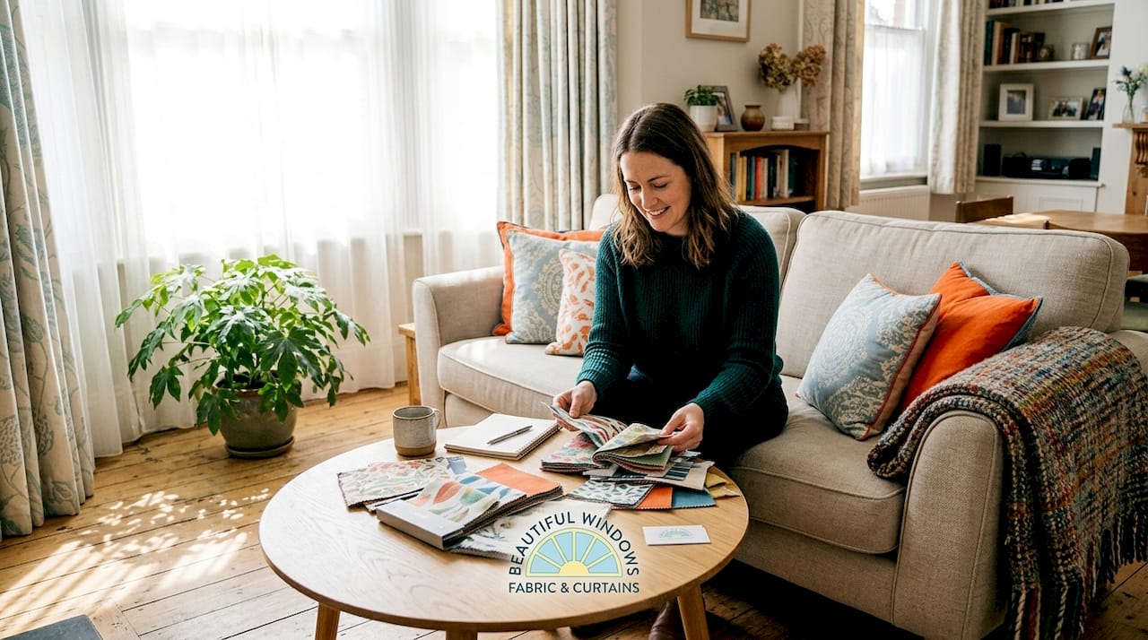
TL;DR:Textile patterns convey cultural stories, influence space perception, and enhance fabric performance in interior design. Choosing patterns based on their cultural significance and design variables like color and scale creates authentic, layered, and functional spaces. Proper pattern selection, layering, and understanding their structural and symbolic roles lead to more deliberate and meaningful decor outcomes.
Textile patterns do far more than fill a room with color. The role of textile pattern in interior design spans cultural storytelling, psychological influence, and measurable functional performance. A well-chosen pattern on a pair of drapery panels or an upholstered chair communicates heritage, shapes how large or intimate a space feels, and in some applications, actively improves a fabric’s performance and durability. For designers, homeowners, and crafters, understanding this depth transforms the way you approach every fabric decision.
Table of Contents
- Key takeaways
- The role of textile pattern across history and culture
- How patterns shape aesthetic appeal in your space
- Functional roles of patterns beyond aesthetics
- Modern trends: biomimicry and heritage in pattern design
- Practical guidance for choosing patterns in your projects
- My perspective on patterns and authentic spaces
- Explore Beautifulwindowselgin’s fabric collections
- FAQ
Key takeaways
| Point | Details |
|---|---|
| Patterns carry cultural meaning | Textile patterns like kente and tartan document heritage and enrich interiors with narrative identity. |
| Patterns shape space perception | Color, repetition, and scale in patterns directly influence how a room’s mood and proportions are perceived. |
| Function follows pattern | Pattern structure aids cutting precision, reduces fabric waste, and supports smart textile development. |
| Layering adds authenticity | Mixing antique and contemporary patterned textiles creates lived-in spaces that avoid a sterile look. |
| Application determines selection | Choosing patterns based on end use — drapery, upholstery, or accent — produces more cohesive, lasting results. |
The role of textile pattern across history and culture
Long before printed catalogs or digital mood boards existed, textile patterns were one of humanity’s primary systems for recording identity. Every woven or printed motif carried meaning that was immediately readable within its community. The importance of textile patterns as a form of visual language cannot be overstated, and that legacy continues to shape how interiors communicate today.
Patterns serve as visual languages expressing history, social standing, and community affiliation, with examples spanning multiple continents and centuries. Scottish tartan identified clan lineage. West African kente cloth encoded the wearer’s status and occasion. Malian bogolanfini, better known as mud cloth, recorded local proverbs and rites of passage through geometric symbols.
This is the design significance most people miss when they choose a fabric solely for its color. When you bring a kente-inspired print or a traditional ikat into a room, you are not simply adding decoration. You are introducing a cultural document into the space. Navajo blankets and African prints embed cultural symbols connecting generations, which is precisely why these textiles hold their visual power decade after decade.
“Textiles are the original archive. Every repeated motif is a sentence in a language that predates writing in many cultures.” — Design historian perspective on the cultural impact of textile patterns.
The practical takeaway for interior designers is clear. Spaces that incorporate culturally grounded patterns tend to feel more layered and considered than rooms dressed purely in trend-driven prints. A room anchored by a single piece with genuine textile heritage reads as curated, not assembled.
- Tartan: Identifies clan and regional lineage in Scottish tradition; translates well into plaid drapery and upholstery with structured repeat.
- Kente cloth: Gold, green, and black geometric weaves from Ghana carrying ceremonial significance; works as bold accent textile in contemporary rooms.
- Bogolanfini (mud cloth): Earth-toned Malian resist-dye fabric with tribal geometry; popular in modern interiors as throw textiles and accent pillows.
- Ikat: A dyeing technique producing blurred geometric prints across Central Asian, Japanese, and South American traditions; elegant as drapery fabric.
How patterns shape aesthetic appeal in your space
The aesthetic power of a textile pattern rests on three variables: color, scale, and repetition. Change any one of them and the emotional effect of the pattern shifts. A large-scale botanical print reads as dramatic and maximalist. The same botanical motif reduced to a half-inch repeat reads as a refined texture at a distance. Understanding this relationship is foundational to the textile pattern design significance in interior work.
Color within a pattern governs mood directly. Warm-toned patterns in ochre, rust, and terracotta generate a sense of intimacy and comfort. Cool-toned geometric patterns in navy, gray, and white feel structured and composed. This is not subjective preference alone. Research confirms that cultural background affects acceptance of aesthetic patterns with statistical significance, meaning the patterns you select communicate differently depending on who occupies the space.
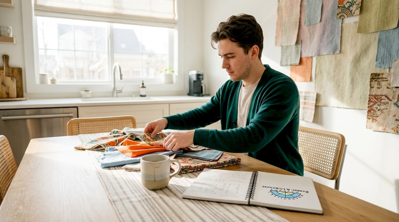
Repetition and structure also influence spatial perception. Vertical stripe patterns draw the eye upward, making ceilings read as taller. Horizontal stripes widen a narrow room visually. A tightly ordered geometric pattern on drapery panels adds visual weight that grounds a large window. These are the mechanics behind how textile patterns influence fashion and interiors alike.
Pro Tip: When layering multiple patterns in one room, use a simple rule: vary the scale. Pair a large-repeat print with a medium geometric and a small-scale texture. Keep at least one consistent color running through all three to hold the composition together.
Layering patterns is where many designers hesitate, but it is also where the most distinctive interiors are made. The key is deliberate variation rather than matching. A jacquard panel in a large floral repeat pairs naturally with a smaller-scale stripe on cushions and a woven texture on upholstery. Each pattern occupies its own visual frequency without competing.
- Use a dominant pattern on the largest textile surface, typically drapery or a sofa.
- Introduce a secondary pattern at medium scale on accent chairs or throw pillows.
- Finish with a textural pattern, such as a subtle woven herringbone, on smaller accessories.
- Anchor the palette by repeating at least two colors across all patterns.
Functional roles of patterns beyond aesthetics
The role of patterns in fabric design extends well past visual appeal into measurable performance territory. This is an area that even experienced designers often underestimate.
Pattern structure directly assists precision in fabric cutting. Automated pattern detection systems in industrial textile production use pattern centers to guide precision cutting, enabling zero-defect and zero-waste manufacturing cycles. At the workroom and DIY level, a clearly defined repeat pattern serves the same purpose. It gives the cutter alignment guides that reduce mismatched seams and minimize wasted yardage.
Newer research shows that pattern design is also being used to communicate functional properties within the fabric itself. Functional visual semantic relevance scores achieved through diffusion models are 35.7% higher than baseline when patterns are mapped to performance properties, meaning the visual design and the textile’s function become mutually reinforcing.
| Pattern type | Primary functional benefit | Common application |
|---|---|---|
| Geometric repeat | Cutting alignment and waste reduction | Drapery panels and upholstery |
| Damask symmetrical | Optical error masking via bilateral symmetry | Formal drapery and accent fabrics |
| Textural weave pattern | Surface grip and durability signaling | Upholstery and high-traffic seating |
| Biomimicry-inspired | Eco-friendly material innovation | Sustainable interior textiles |
The example of damask is worth examining closely. Bilateral symmetry in damask patterns functions as optical error correction, causing the human eye to perceive precision even when minor thread misalignments exist during weaving. This structural intelligence is one reason damask patterns have survived for over 500 years without becoming obsolete. The pattern is doing functional work, not just decorative work.
Modern trends: biomimicry and heritage in pattern design
Two of the most meaningful forces currently shaping textile pattern design are biomimicry and the resurgence of traditional African prints. On the surface they appear unrelated. In practice, they share a common thread. Both draw pattern logic from systems that have been tested and refined over generations, whether in nature or in cultural tradition.
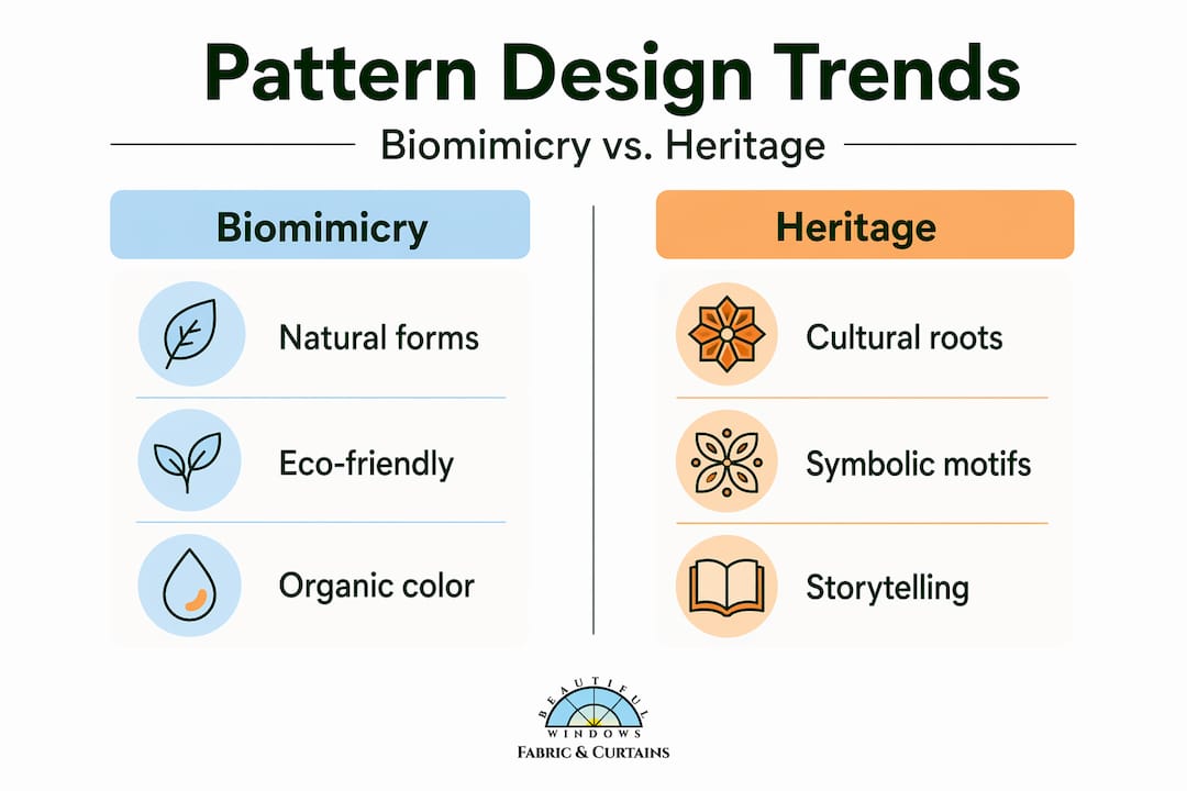
Biomimicry inspires innovative textile patterns that offer both aesthetic diversity and sustainability benefits, with industry experts identifying it as a basis for eco-friendly, durable textile development. Patterns derived from leaf venation, honeycomb geometry, and fish-scale arrangements are showing up in interior textiles as both surface decoration and structural guides for more efficient fabric construction.
Pro Tip: When selecting textiles for sustainability-conscious projects, look for weave structures and prints that reference natural forms. These patterns often indicate that the designer has considered both the visual and material logic of the fabric, which tends to translate into better longevity.
| Trend | Origin | Interior application | Sustainability factor |
|---|---|---|---|
| Biomimicry patterns | Natural forms and systems | Drapery, upholstery, wall textile | Guides material efficiency and durability |
| Contemporary African prints | Traditional symbolic motifs | Accent pillows, throws, decorative panels | Supports artisan production and cultural preservation |
Contemporary African prints represent a parallel movement. Rather than being used as novelty or trend items, designers are sourcing these textiles for their symbolic depth and their ability to carry narrative weight in a modern interior. The cultural impact of textile patterns derived from Ghanaian or West African traditions is not diminished by being placed in a Columbia, SC living room. If anything, the contrast amplifies the story the room tells.
Practical guidance for choosing patterns in your projects
Selecting textile patterns for an interior project becomes far more straightforward when you work from the room’s function and mood outward, rather than from the pattern inward. This is the single shift that separates deliberate design from decoration by accident.
Start by assessing the application before choosing the pattern. Drapery fabric hangs vertically and catches light differently than upholstery fabric, which must withstand compression and friction. A pattern that reads beautifully as a flat swatch may shift significantly when gathered into pleats or stretched across a cushion form.
- For drapery: Choose patterns with vertical flow or large-scale repeats that maintain legibility when the fabric falls in folds. Damask, stripe, and botanical prints perform consistently well.
- For upholstery: Select tighter weave patterns with high rub counts. Geometric and textural weaves hold their appearance under regular use better than loosely printed patterns.
- For accent textiles (pillows, throws): Use this as your opportunity for bolder cultural or artistic pattern choices. These pieces refresh easily and carry pattern-forward impact without long-term commitment.
- For mixing antique and contemporary: Layering antique culturally significant textiles with modern elements prevents interiors from feeling staged, according to professional designers who recommend acquiring antique textiles even when there is no immediate placement in mind.
Sourcing patterned textiles with genuine design integrity requires knowing what to look for. A guide to designer textiles helps distinguish between mass-produced prints and fabrics with considered woven or printed pattern structures. The repeat registration, the hand feel, and the color saturation all signal the quality of the pattern’s execution.
My perspective on patterns and authentic spaces
I have worked with patterned textiles long enough to know that the rooms people remember are rarely the ones with the most expensive furniture. They are the rooms where the patterns tell a story that feels specific to the person living there.
What I have found consistently is that designers and homeowners underestimate how much a single culturally grounded textile can shift the entire tone of a space. One mud cloth throw, one jacquard panel in a heritage weave, or a set of ikat draperies can give a room a sense of depth that no amount of neutral layering achieves. The tension between traditional pattern structures and clean contemporary furniture is not a problem to solve. It is the point.
I have also learned that function and aesthetics are not competing priorities in pattern selection. The damask symmetry principle taught me to look for pattern structures that do multiple jobs at once. The best textile choices I have seen in real projects are always the ones where the pattern earns its place visually and structurally.
My honest advice: stop treating pattern selection as the final step in a design project. Start with it. The pattern you choose for your fall window treatments will govern every other decision in the room far more than your paint color will.
— Marrion
Explore Beautifulwindowselgin’s fabric collections
When your design vision calls for patterned textiles with real quality behind them, Beautifulwindowselgin offers a curated selection built specifically for interior applications.
The collections include stripe fabrics for structured, classic looks, abstract artistic textiles for contemporary and expressive interiors, and brown upholstery and drapery fabrics ideal for warm, grounded color palettes. Each fabric is available by the yard, with designer options in jacquard satin, embroidered weaves, and upholstery-grade textiles. Custom drapery services and design consultations are available nationwide. If you have questions about selecting or ordering, the fabric FAQ page provides clear guidance on pricing, quality, and specifications.
FAQ
What is the role of textile pattern in interior design?
Textile patterns serve both aesthetic and functional purposes in interior design. They shape mood, define spatial perception, communicate cultural meaning, and in structured applications like damask, even correct visual imperfections in the weave.
How do textile patterns influence the mood of a room?
Color, scale, and repetition within a pattern directly affect how a space feels. Warm-toned large-scale patterns create intimacy, while cool geometric prints in tight repeats produce a structured, composed atmosphere.
Why do culturally significant textile patterns matter in home decor?
Patterns like kente cloth, ikat, and mud cloth carry documented cultural histories and symbolic meaning. Incorporating them into an interior adds narrative depth that purely decorative prints cannot replicate.
How does pattern design affect fabric functionality?
Pattern structure guides precision cutting to reduce waste, and symmetrical patterns like damask use optical geometry to mask weaving imperfections. Newer diffusion models show that aligning pattern design with functional properties improves coherence by 35.7%.
How do I mix multiple patterns without creating visual chaos?
Vary the scale across patterns, using one large-repeat dominant print, one medium geometric, and one small-scale texture. Maintain a consistent color thread running through all three patterns to unify the composition.
Recommended
- The Role of Fabric Texture in Home Décor Design – Fabric Store in Columbia, SC | Drapery Making Services
- Decorative Textiles: Transform Your Space with Style – Fabric Store in Columbia, SC | Drapery Making Services
- How the right textiles elevate home décor and comfort – Fabric Store in Columbia, SC | Drapery Making Services
- What is designer textile? A guide to luxurious home fabrics – Fabric Store in Columbia, SC | Drapery Making Services